When they work effectively, landing pages motivate customers to take an important step.
This may be making a purchase, subscribing to a newsletter, downloading a free trial, or setting an appointment.
Basically, the landing page is what they see before they decide whether or not to take their relationship with your brand any further.
It’s imperative that your landing pages convert customers. If they don’t, you could be losing money on your paid ad campaigns. Fortunately, it isn’t difficult to create a high-converting landing page.
Just apply these 16 tips.
#1. Use Visuals to Increase Interest and Time on Page
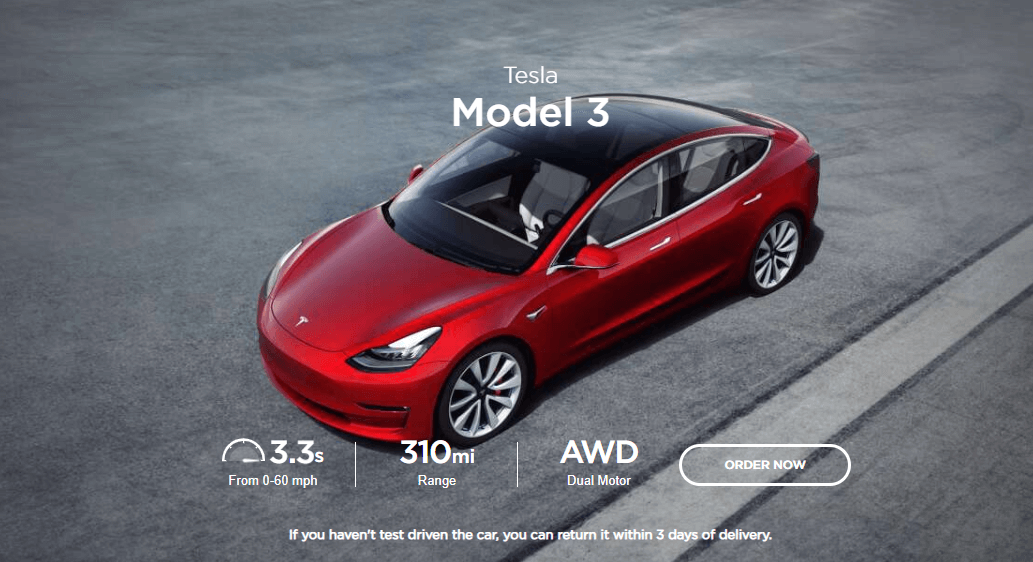
It’s no secret that visuals will improve the performance of any page. This remains true when it comes to your landing page. Just remember that it’s not enough to include a few stock images. Instead, include quality images of:
- Your products
- You or your team members
- Satisfied customers
- Diagrams or infographics
Videos are also quite effective on landing pages. Just be sure to use some best practices if you decide to go this route.
#2. Lead Off with a Great Headline
A well-written headline can really entice people to continue reading.
It’s the first thing that people are going to see when they click over and plays a huge role in whether or not they will convert.
Keep headlines short, use power words, and try the headline analyzer tool to measure its effectiveness.
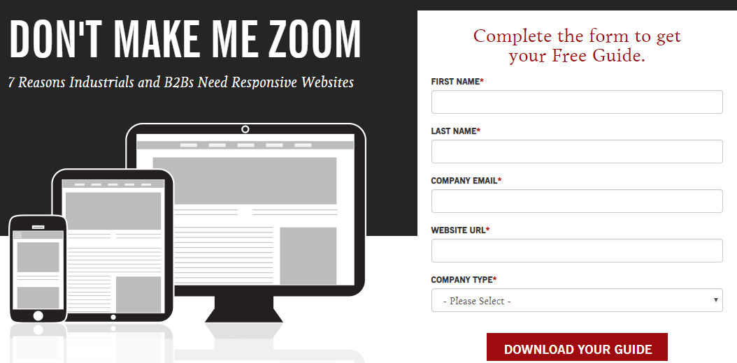 Industrial Strength Marketing Landing Page
#3. Create Dedicated Landing Pages
Never route people to a one-size-fits-all landing page.
Think about it:
You’ve dedicated time and resources to writing content, even paying for ads, to tell people about a product or special event. Why would you then send them to your homepage or generic landing page?
Every sale, event, product, or service deserves a dedicated landing page.
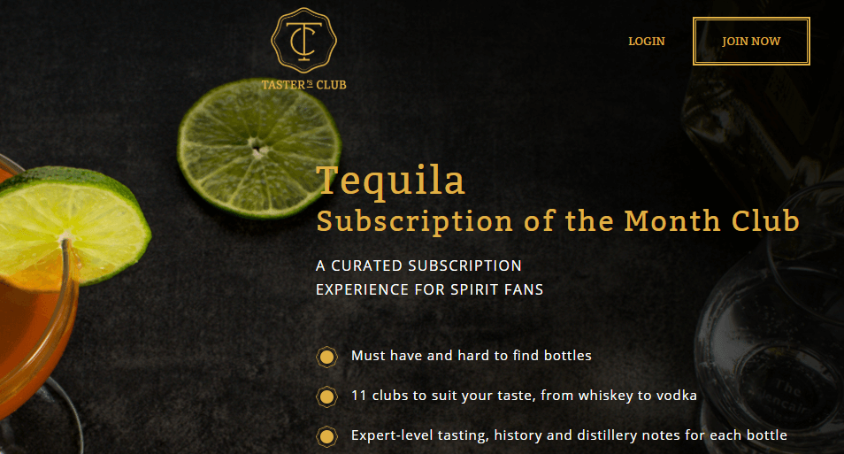
#4. Insert Trust Elements
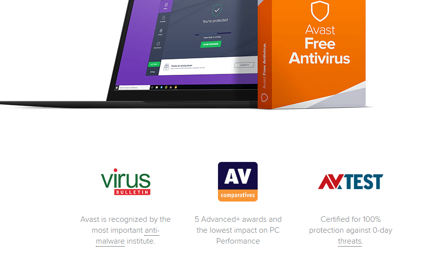
Landing page trust elements include badges, customer testimonials, expert quotes, and data. These things show that your business is trustworthy and that whatever you are offering is of high quality. When people see these, they’re more likely to move forward with you. Just be sure to remember these caveats:
- Trust elements should be relevant. If not, they are a waste of time.
- They should be credible. Internet shoppers are savvy, and they know the difference between a trust badge you’ve paid for and one that comes from a reputable company.
- Testimonials should be short and sweet.
- Data should be current.
#5. Don’t Clutter the Page
If you use a website template, consider creating a new one for landing pages.
Strip out the navigation on the top of the page and sidebar. These can be cluttering and confusing. They give people a path away from your CTA button. The only things on your landing page should be relevant to your promotion.
#6. Localize Your Landing Page
If you have a global audience, you probably localize a lot of your content. Consider doing the same for your landing pages. Since prices, pain points, even purchasing processes can vary from one place to another, shouldn’t your landing pages reflect that? By localizing, you can address people in their language, use images and other content that is relevant to them, even customize your forms for them.
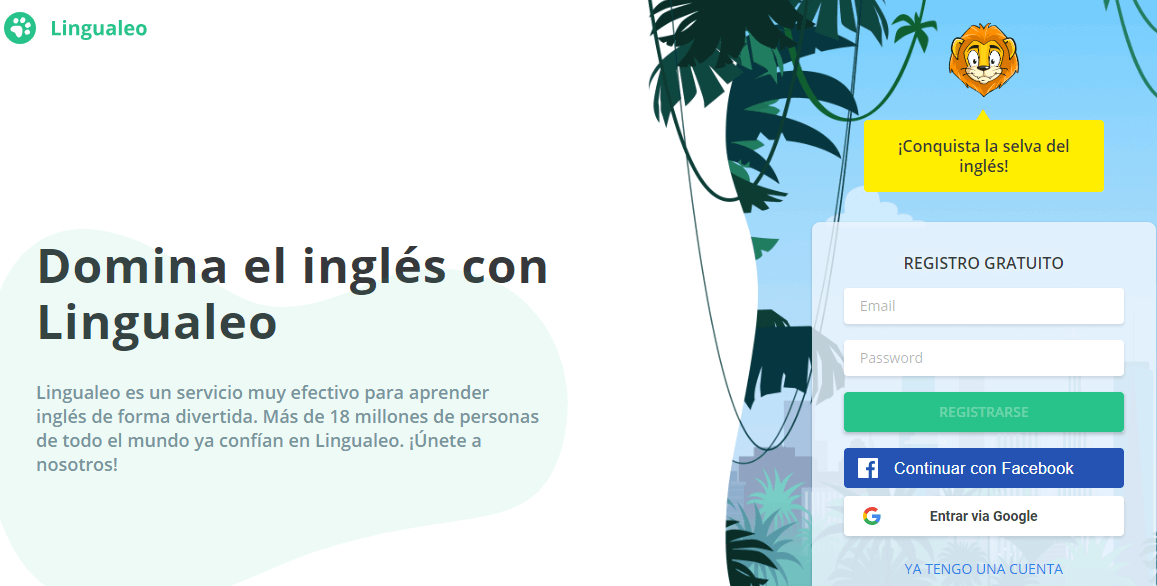 Spanish Version of Lingualeo Homepage
#7. Consider The Objections
What if it’s too expensive? What if I don’t like it? Wow! That’s a really long commitment! It’s smart to consider any objections that people might have to convert. Once you know what those might be, you can tackle them head-on by addressing them on your landing page.
- Price concerns? Offer a financing option.
- Commitment phobia? Share that you have a two-week money-back guarantee.
- Fear of buying the wrong type or size? Share a short instructional video.
#8. Choose The Best Typography
Once upon a time, only graphic artists really cared much about fonts. Now, they are seen as an important part of your branding. Choose a font that’s readable, but also a great fit for your promotion.
#9. Highlight The Benefits Not the Features
You have limited time and space to talk about your offer. Don’t waste it going into details about the features. Instead, play the tape forward and let people know how they will benefit from converting. For example, if you are trying to get subscribers to your fitness and weight loss newsletter, don’t tell them that they’ll receive content written by professional trainers or workout tips. Instead, tell them they’ll get the help they need to reach their fitness goals.
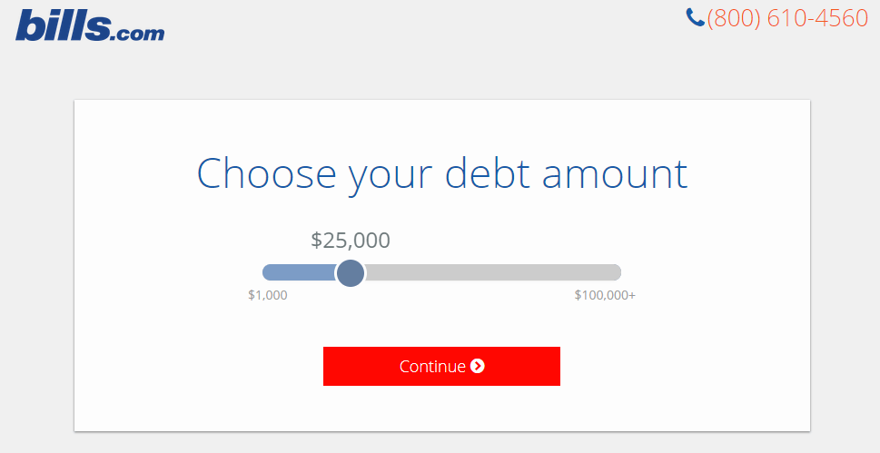
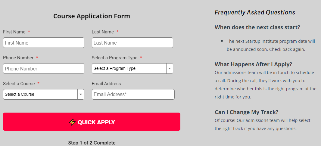
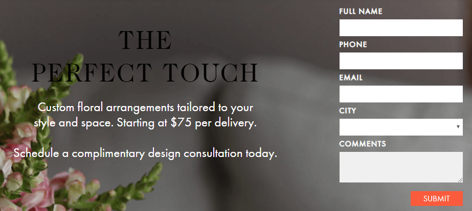
#10. Shorten Forms
Long, complex forms are a real turn-off. Remember that you’re already asking people to take the steps to convert. Don’t make the process painful or intrusive. Keep forms short, and only ask for the information you need. Don’t sacrifice conversions in an effort to collect data.
#11. Focus on Quality Copy
Whether it’s a blog post or landing page, quality copy matters. Good writing that’s free from error builds trust.
Fortunately, there are several tools and pro resources that you can use to ensure that your landing page copy is up to par:
#12. Use Social Proof
If you include social proof on your landing pages, you can create credibility and trust with your audience. Social proof indicates to potential customers that others have followed you on social media, shared your offer with others, or answered your call to action. If you have a healthy social following and have received a good response to your campaign, consider adding that social proof to your landing page.
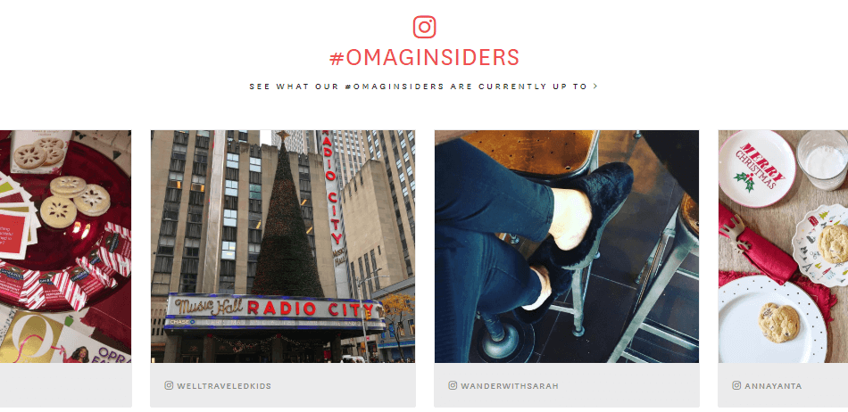 O Mag Insider and its Instagram Wall
#13. Implement Good Pricing Psychology
If it’s relevant, you should include price information on your landing page.
How you choose to display your prices can make a big difference. Take some time to learn about pricing psychology.
If you’re selling a luxury or recreational item, you might consider prestige pricing which has more of an emotional appeal. If your item is practical or geared towards the budget-minded, try charm pricing or nines pricing.
#14. Have a Clear Call to Action
Sylvia Giltner, a chief editor at Resumes Centre says:
“We spend at least as much time on the CTA of each landing page as we do on every other element combined. Everything from the color and placement of the button to the text we use deserves careful attention. Our analytics show that this element has the biggest impact on conversions.
#15. Include a Micro Conversion Option
Not everyone who comes to your landing page is going to convert. That doesn’t mean that you or they have to leave empty-handed. Consider including a micro-conversion option. This is a step that the user can take that will move them further down the sales funnel without full conversion. This might include:
- Clicking a link to a product demo video.
- Downloading a white paper
- Signing up for a newsletter
- Requesting a price quote
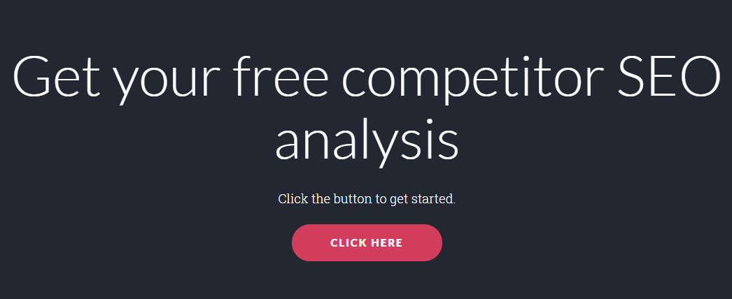 Web Profits Free Analysis Option
#16. Keep Your Message Consistent
If people are clicking into your landing pages from ads, blog posts, or sponsored content, they shouldn’t be surprised by what they see.
Chris Mercer, CEO of Citation says:
“Your landing page should contain the same phrasing, prices, and other information as your ad or post content. In fact, you might consider using the same images, fonts, and color schemes to create that continuity.”
Final Thoughts
A completed landing page represents a lot of time and effort.
They’re also the final thing customers see as the result of your paid campaigns.
Get the most out of your efforts by designing landing pages that earn high conversion rates
.



No comments:
Post a Comment